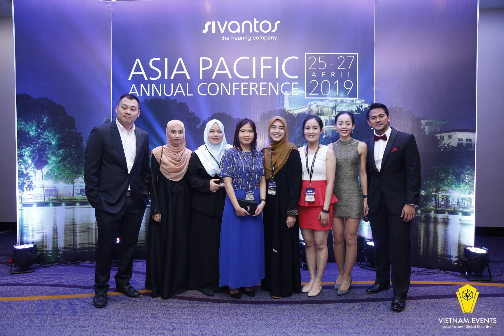
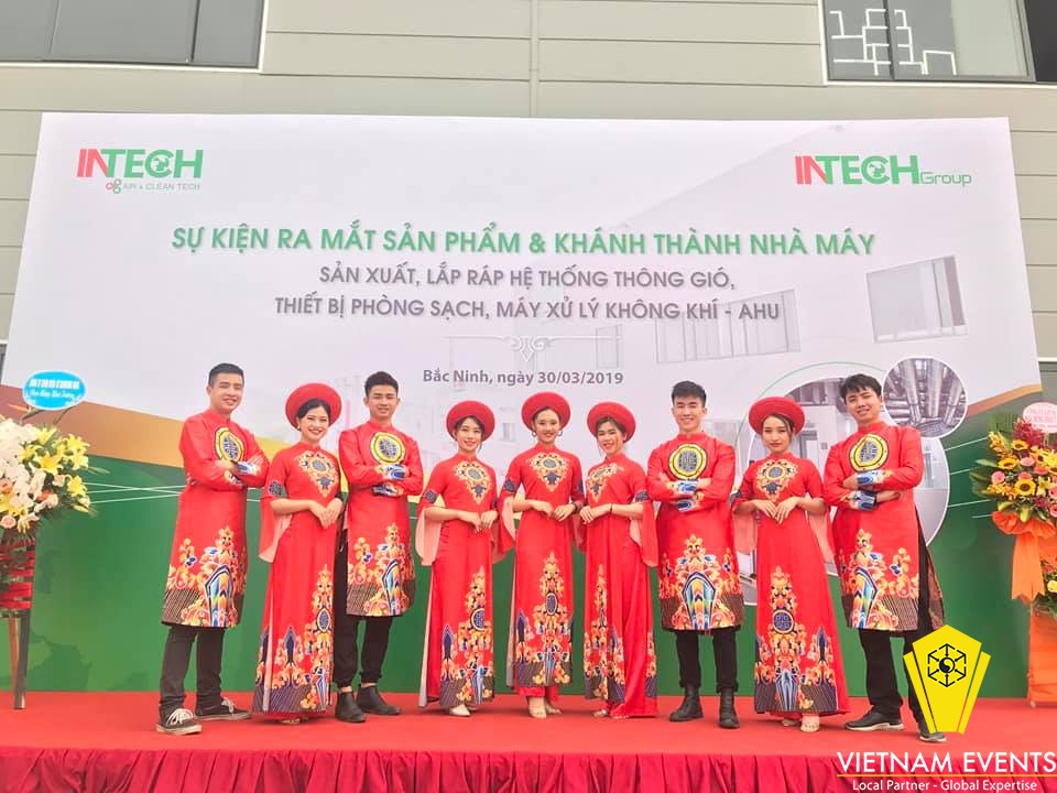
A backdrop usually consists of four components: Images showing themes, messages, ideas- Text, Logo of related units, Supporting graphic elements.
Logo:

- Logo of the units is always in a formal position; should be placed at a height of at least 1.7m or more so as not to be covered by the person standing on the stage; dark at the feet;
- Order of the top - bottom, right - left ... of the logo of the units in relation to position, role…
The logo should be identical to a graphic format, i. e: if the same is the original color logo, it is all consistent; if it is negative or positive, it is also negative / positive; if there is a white box, the same box is white ...;
- If there is only one or a few logos, try to apply the brand identity of each brand. If there are many logos that the background image is difficult to highlight the logo, it will need to add a graphic element to create the background for each logo.
Text:
- The name / main content of the event must be at a height of 1.7m or more (if the total height of the backdrop is not limited);
- If it is an organization event, text should apply according to the standard identity font of the brand identity. But if it is a special event, you can use fonts that are not in the brand indentity guidelines, but best represent the theme, concept of the event
- Avoid using multiple fonts on a backdrop. Normally, only up to 3 fonts are allowed: one font for the main name, one for extra names or detailed content – one for time, place, one for titles of component elements such as organizational units, sponsors ...;
- The color of the font should follow the color of the brand identity or the overall color of the event, or use contrasting colors in the same color range to match the rest of the graphic elements;
- The backdrop font must be consistent with the font of the other communication methods of the event. This is called a "consistency" principle;
- Font size must be proportional to the size of the backdrop and size of other elements on the backdrop. The size font between text clusters must be harmonious, avoid too much difference, but there must be enough diversity to express the main content.
Images:
+ Images must be clear and enough pixels to design ;
+ Images must be convenient for layout and highlighting text;
+ The image must be kept completely in composition, the message hidden when resizing according to the size of the backdrop;
+ Photos must be copyrighted;
+ Images should be unique , not too popular
+ The image must have contrasting color but not in contrast to the color of the wall or space of the setup location. If set up location has white walls but you use backdrop with white background , so it will make people look from faraway confuse backdrop and walls.
Supporting graphic elements:

- Use when neccessary. Usually when the main image is not unique enough or it is not enough to express the main theme, convey the message, it is necessary to use additional graphic elements;
- If it is not a brand format, it should ensure the relevant factor with the theme, topic, idea ...;
- Must comply with color rules with text colors and background image colors. Do not overwhelm main content and images;
- Must be harmonious in proportion. Usually should not exceed 1/3 of the size of the backdrop;
- Not too popular;
- Cultivate graphic lines.
Here are some tips to event backdrop design. Remember this to design best event backdrop for your company.
Views: 6029


